Who knew? I not only mumble but I bumble too!! Just a woman of multi-talents, that's me.
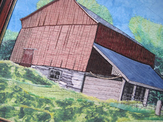
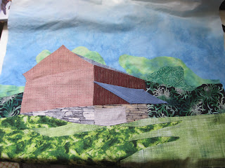
To explain....I've been working away on Barn #2 and decided I wasn't happy. Not at all. Quite perturbed actually. It just plain didn't look right. Of course not having taken any lessons in this form of art and having to rely on what tidbits I can glean from books and the internet makes it a lot more difficult. Not having any training in art whatsoever is probably the biggest issue.
Anyhoo.
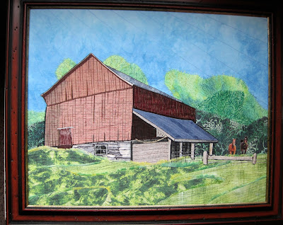
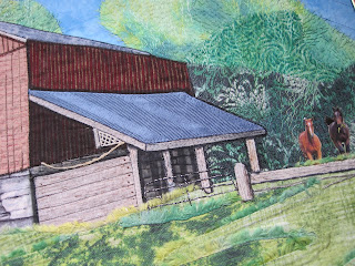
Here's what I've done so far and maybe (most likely!!) you can see what has me wondering...
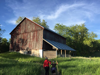
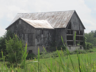
The scene I'm attempting to use for inspiration is this one....
I'm limited in what I use for fabrics to what I have in my stash so that's part of the problem. Anyway....do you see the grass? Can you see that it's a great big fat mound of yuck? I wanted a field of grass and it looks like there's too much 'distance' to it - for lack of a better explanation. It's too much.
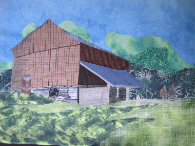
So I putzed a bit and laid some
fabric over top to audition and came up
with this...
To my seriously un-trained eye I think it looks better. It's no longer seeming to be the focal point. Maybe. Or maybe not.
Suggestions?
Ideas?
or should it be scuttled altogether?
*******
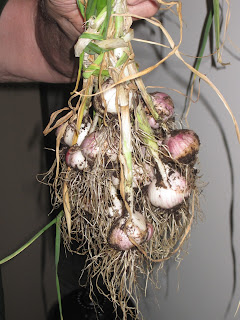
Oh, and just for fun, how about a picture of DH's garlic crop? Planted in a container on our balcony!
Today the quote is from Warren Buffet...."It is better to be approximately right than precisely wrong"


